THE PRODUCT
In this project, a responsive website was designed to create a user flow to set up a personal bank account.
PROJECT DURATION
April 2022 – May 2022 (2 months)
THE PROBLEM
Signing up for a bank account can be challenging and time consuming, especially for someone opening an account for the first time. For those unfamiliar with basic financial terms, the process can feel overwhelming.
THE GOAL
Develop a responsive website for MoneyTree (a fictional bank) that makes signing up for a personal bank account simple.
TARGET AUDIENCE
Anyone looking to sign up for a personal checking or student checking bank account.
MY ROLE
As a student, I acted as both the Lead UX Designer & Researcher for this project.
RESPONSIBILITIES
- User & Competitive Research
- Sitemap Creation
- Wireframing
- User Testing
- Low & High Fidelity Prototyping
UNDERSTANDING THE USER
- USER RESEARCH
- PERSONAS
- PROBLEM STATEMENTS
- USER JOURNEY MAPS
USER RESEARCH
User and competitive research was conducted to identify challenges with the existing checking account sign up process at different banks.
I assumed that comparing the different interest rates and disclaimers between accounts would be confusing for first time account openers, but was surprised at how difficult it was to navigate some competitor’s websites to find that information.
I conducted secondary research from direct competitors like KeyBank, Bank of America, and M&T Bank, as well as primary research in the form of user interviews. I sent out a survey to 1 female participant and 2 male participants to get their perspective.
If I were to conduct this research again, I would likely work to identify indirect competitors as well, survey a larger sample size, and conduct a usability study.
PAIN POINTS

PERSONA & PROBLEM STATEMENT
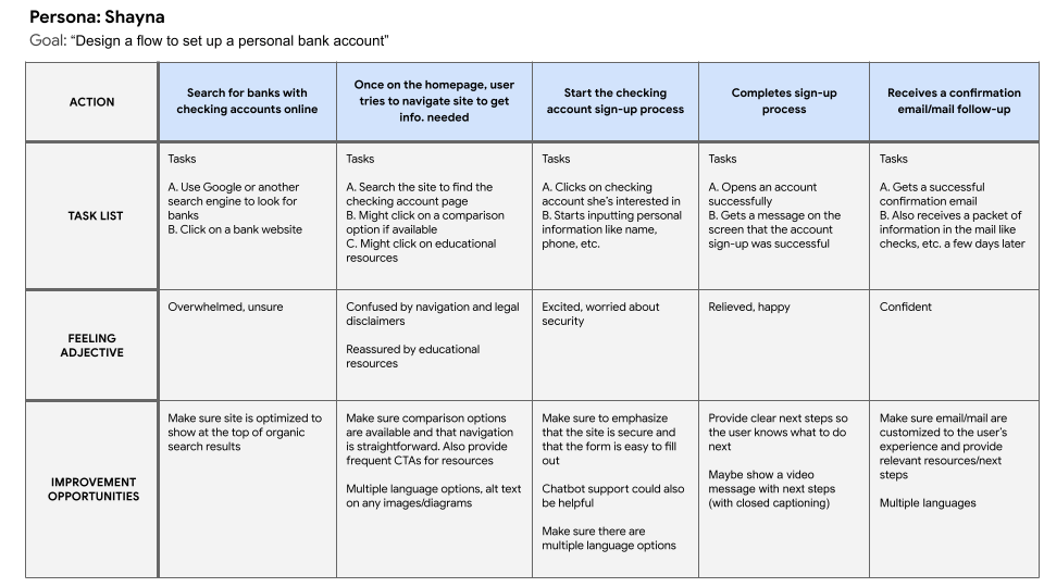
Shayna is a busy student who just got her first job. She needs to sign up for her first checking account so she can receive her paychecks via direct deposit.

USER JOURNEY MAP
This user journey map was created for Shayna’s persona.
Outlining tasks, as well as the user’s feelings during the process made it easier to think through the user flow for signing up for a bank account.
From this user journey map, I found it was important to show CTAs throughout the site to access personal finance resources, as well as provide amble comparison options and support.
STARTING THE DESIGN
- SITEMAP
- PAPER WIREFRAMES
- DIGITAL WIREFRAMES
- LOW-FIDELITY PROTOTYPES
- USABILITY STUDIES
SITEMAPS
To determine how best to structure the website to make it simple to navigate, a sitemap was created. Sitemaps are also important from an SEO perspective, since they help determine how pages on a site should be foldered structurally.

PAPER WIREFRAMES

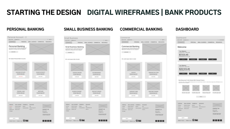
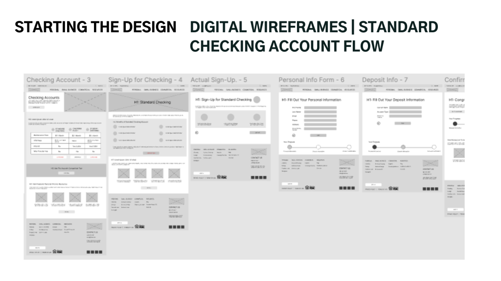
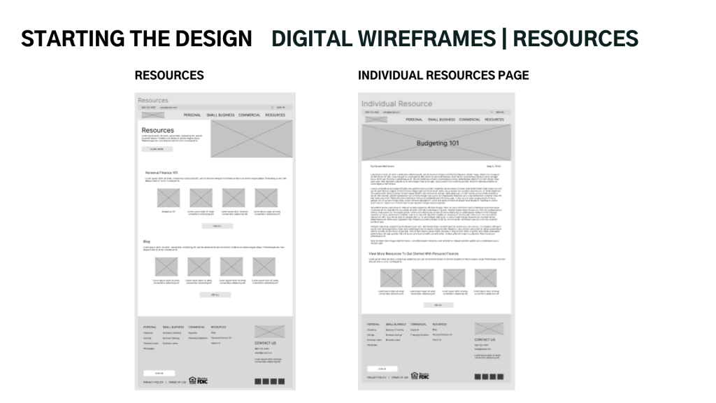
DIGITAL WIREFRAMES


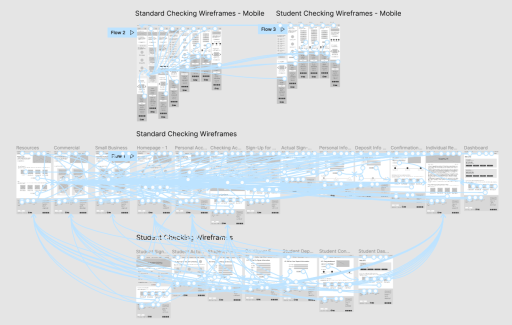
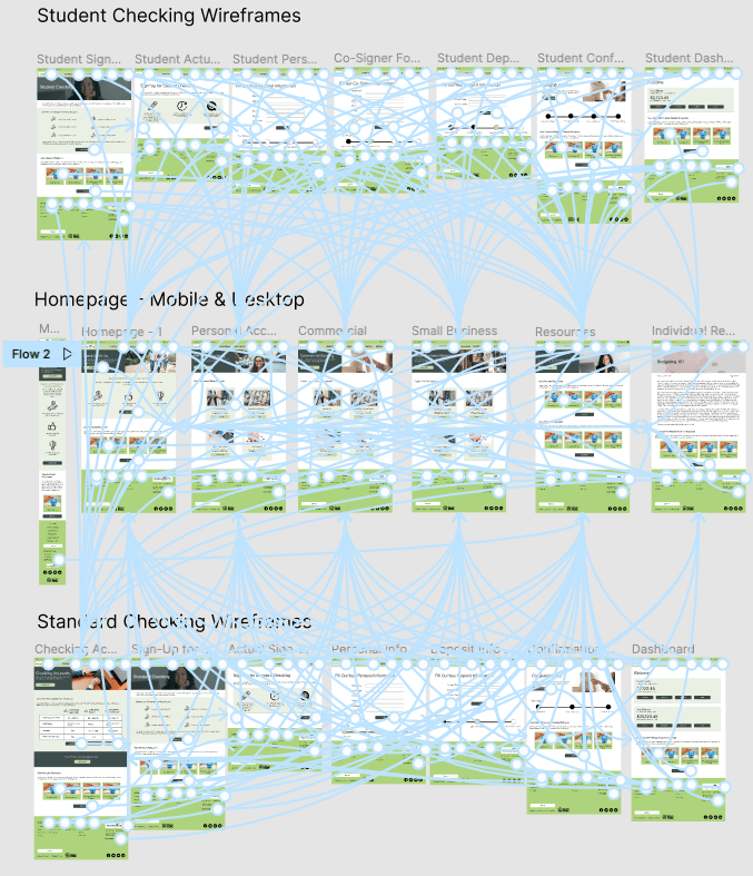
LOW-FIDELITY PROTOTYPE
USABILITY STUDY – PROCESS
- Sent a survey to participants in the United States
- 3 participants, 1 male and 2 females between the ages of 23 and 55
- Users were asked to move through the main user flow to determine how easy or difficult it was to navigate based on a System Usability Scale of 1-5
Research Questions:
- How easy or difficult is it to navigate this website?
- On a scale of 1-5, (1 being most difficult, 5 being easiest) how would you rate the navigation of this website?
- Are there any features missing that you would’ve liked to see?

REFINING THE DESIGN
- MOCKUPS
- HIGH-FIDELITY PROTOTYPES
- ACCESSIBILITY
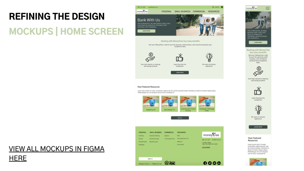
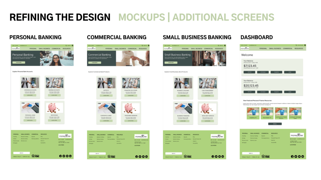
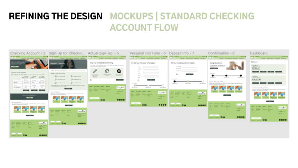
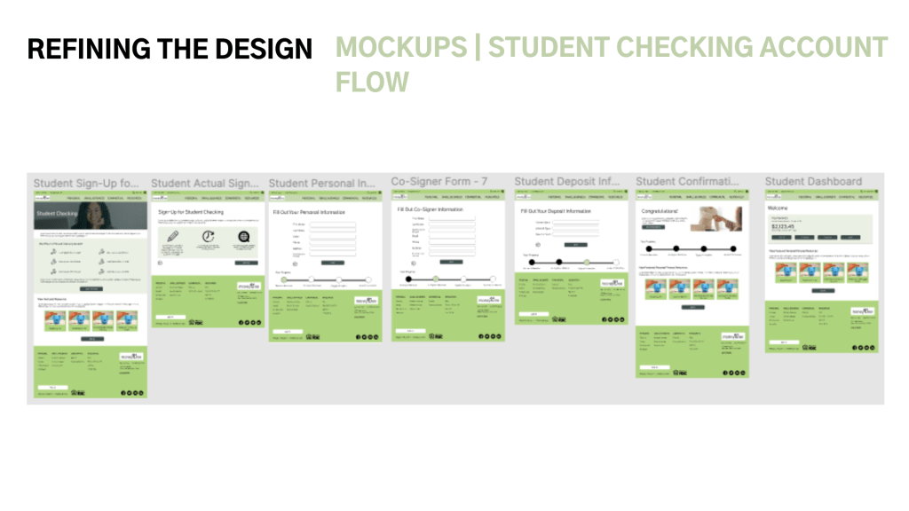
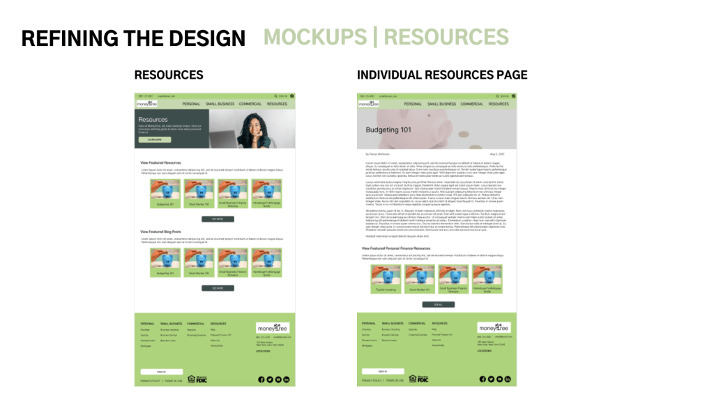
MOCKUPS

HIGH-FIDELITY PROTOTYPE
ACCESSIBILITY CONSIDERATIONS
- Accessibility Settings are available in the footer for users to change their preferences
- Language Settings are available from the utility nav on every page so users can manage/sign-up for their bank accounts in their preferred language
- Sufficient Color Contrast – text and buttons used appropriate color contrast so users with visual impairments/color blindness would be able to view information on the screen and navigate the site
GOING FORWARD
- TAKEAWAYS
- NEXT STEPS
TAKEAWAYS
This website was never developed, but users did feel that the app made it simple to register for a personal bank account.
“I found the basics right away. I liked the learning tools idea – stock market 101” – Survey Respondent 2
Through this process I’ve learned that designing a website takes a lot of careful planning, and it’s a lot easier to wireframe when you’ve already laid out the foundation for the site with a sitemap and identified what pages you need.
NEXT STEPS
- Continue mocking up screens for mobile devices and tablets, and mockup a contact form
- Run a usability study with a more diverse sample set to test functionality on these new devices and accessibility settings
- Further build-out the Resources section to provide more financial literacy resources. Consider a quiz that helps guide users toward an account that’s right for them.
If you liked this case study, get in touch with me! Or, view the rest of my portfolio.
Thanks for viewing!
🥩 🥑 You might enjoy this related case study: NUTRA-CALC: Creating a Nutrition Facts Calculator For an Australian Steakhouse
