
THE PRODUCT
In this project, a job search responsive website and mobile app were created to help formerly incarcerated individuals find new jobs.
PROJECT DURATION
May 2022 (1 month)
THE PROBLEM
It can be very difficult for formerly incarcerated individuals to find jobs due to biases and gaps in work experience.
THE GOAL
Develop a responsive website and mobile app for businesses open to hiring formerly incarcerated individuals to connect with these candidates, and to make it easy for these candidates to apply for jobs.
TARGET AUDIENCE
The target audience for this app/responsive website are formerly incarcerated individuals looking for employment and businesses open to hiring candidates with criminal records.
MY ROLE
As a student, I acted as both the Lead UX Designer & Researcher for this project
RESPONSIBILITIES
- Sitemap Development
- User & Competitive Research
- Wireframing
- User Testing
- Low & High Fidelity Prototyping
UNDERSTANDING THE USER
- USER RESEARCH
- PERSONAS
- PROBLEM STATEMENTS
- USER JOURNEY MAPS
USER RESEARCH
Secondary research was conducted to better understand why formerly incarcerated individuals have difficulty getting jobs, and the organizations that exist now to support this population.
Although I do not personally know any formerly incarcerated individuals, I did my best to use information available online to better understand this population and the struggles that they are going through.
Job platform direct competitors like Indeed and indirect competitors like LinkedIn’s job function were also studied to get a better sense of how the user should move through the application process on the Easy Jobs app or website.
PAIN POINTS

PERSONA & PROBLEM STATEMENT
As a previously incarcerated individual who is now unemployed, Steve needs to find a job so he can support himself and his girlfriend and move on from his time in prison.

USER JOURNEY MAP
This user journey map was created for Steve’s persona.
Outlining tasks, as well as the user’s feelings during the process made it easier to identify improvement opportunities in the existing job search process, and understand what challenges formerly incarcerated individuals face when trying to find a job.
From this user journey map, letting applicants know when their application was opened, in-app reminders/notifications, and providing resources to guide the user through the process were important.

STARTING THE DESIGN
- SITEMAP
- PAPER WIREFRAMES
- DIGITAL WIREFRAMES
- LOW-FIDELITY PROTOTYPES
- USABILITY STUDIES
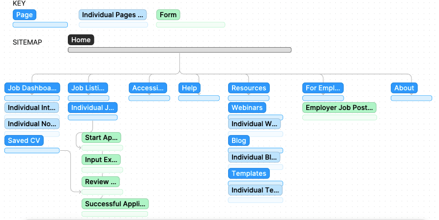
SITEMAP
This sitemap was created in Figma to outline all the necessary pages needed for my responsive website. Pages are dark blue, markers to indicate individual pages are in light blue, and pages containing forms are green.
CRAZY 8s EXERCISE
Initial sketches were created for the desktop version of the responsive website using the Crazy 8s exercise. In this exercise, I set a timer for eight minutes and developed eight ideas for different pages on the site.

DIGITAL WIREFRAMES

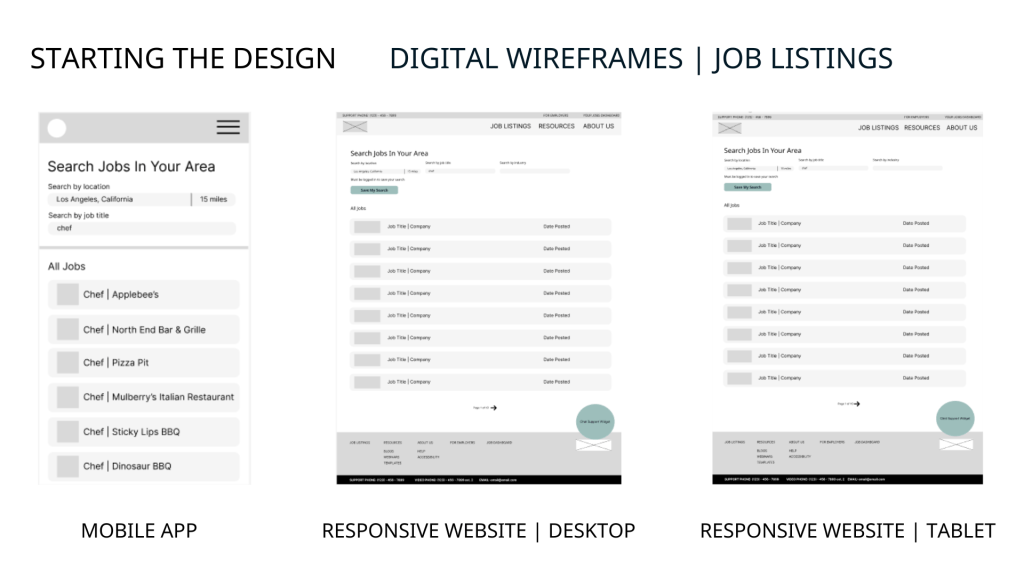


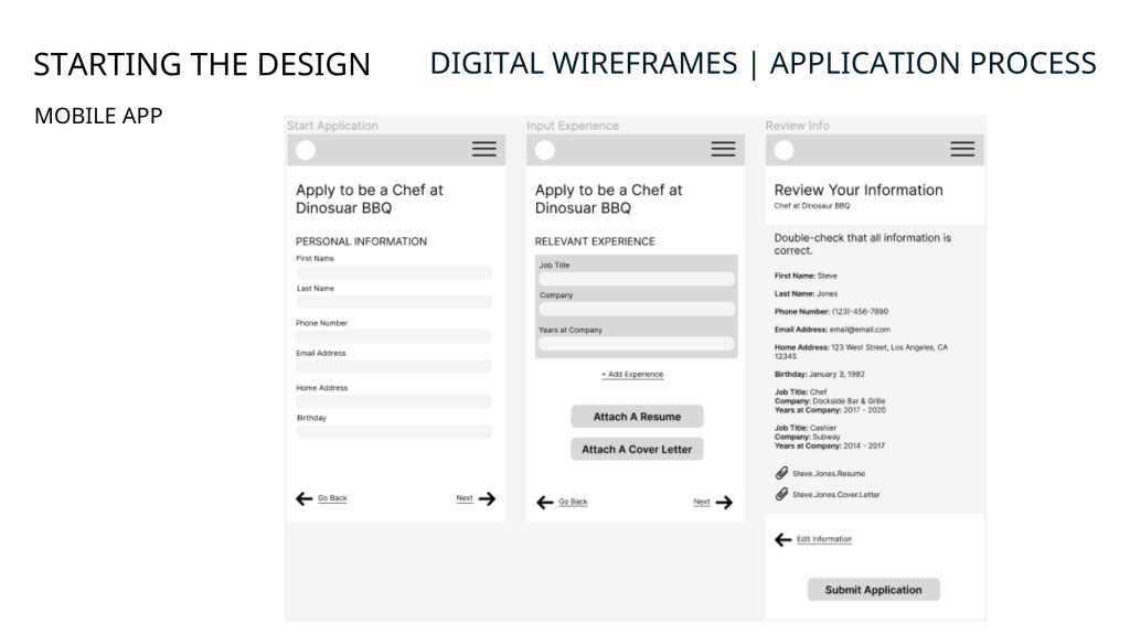


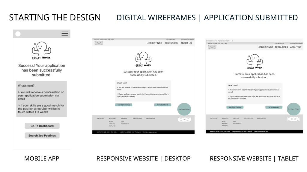
LOW-FIDELITY PROTOTYPES
Main User Flow: “Design a multi-platform job search service to help people who are formerly incarcerated”

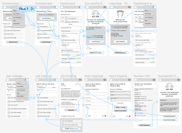
📱 View the mobile low-fidelity prototype
💻 View the desktop/tablet low-fidelity prototype
USABILITY STUDY
A moderated usability study was conducted to determine whether participants in the study could apply for a job on the Easy Jobs mobile app without any obstacles. 3 males and 2 females between the ages of 23 and 55 were asked to apply for a job using the mobile app platform on the low-fidelity prototype.
Some sample research questions include:
- You’ve arrived on the homescreen, to apply for a job what would you do next?
- Now that you’ve submitted your application, go to the dashboard. Is the information found on the dashboard helpful or unhelpful?
- Overall how would you rate the usability of this app on a scale of 1-5 (one being hardest, 5 being easiest)? Why?
- Were there any features not included in the app that you would’ve wished to see?
STUDY FINDINGS
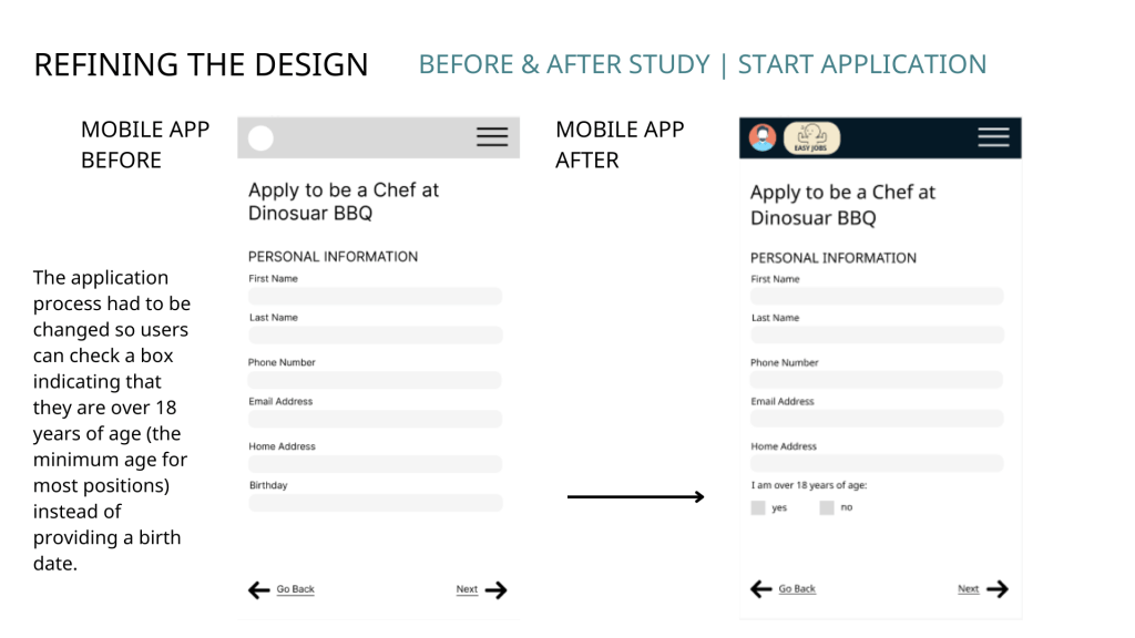
- 1/5 study participants felt uncomfortable providing a birth date, as a result the application process had to be changed so users can check a box indicating that they are over 18 years of age (the minimum age for most positions) to avoid agism.
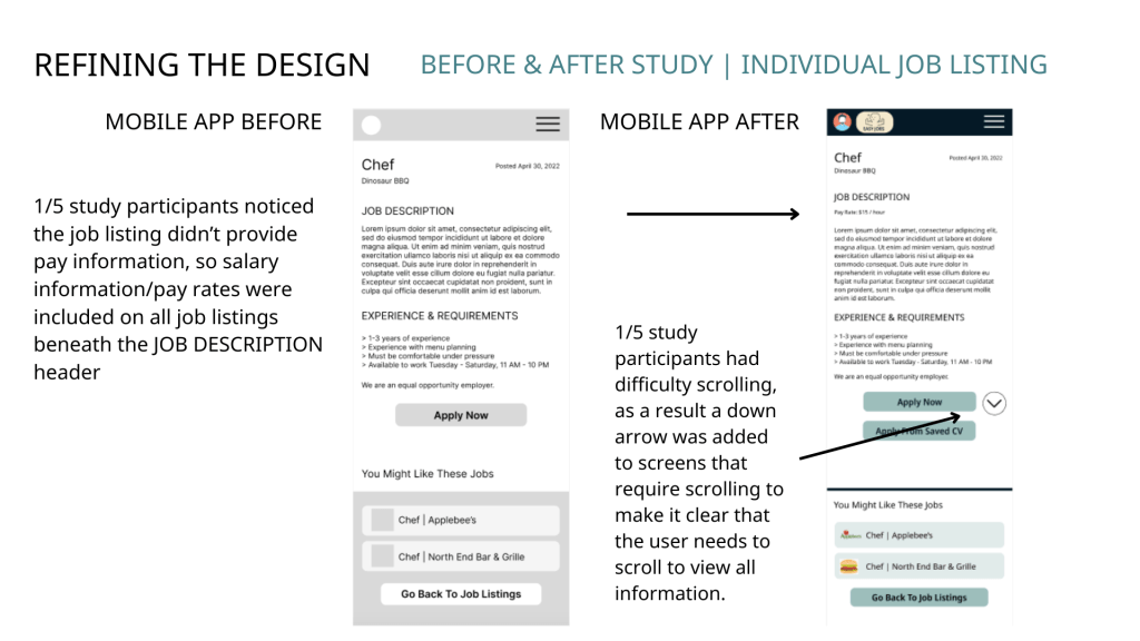
- 1/5 study participants had difficulty scrolling, as a result a down arrow was added to screens that require scrolling to make it clear that the user needs to scroll to view all information.
- 1/5 participants noticed there wasn’t a way to address gaps in work history for incarcerated individuals, a section was added to the application to allow applicants to explain gaps in work history.
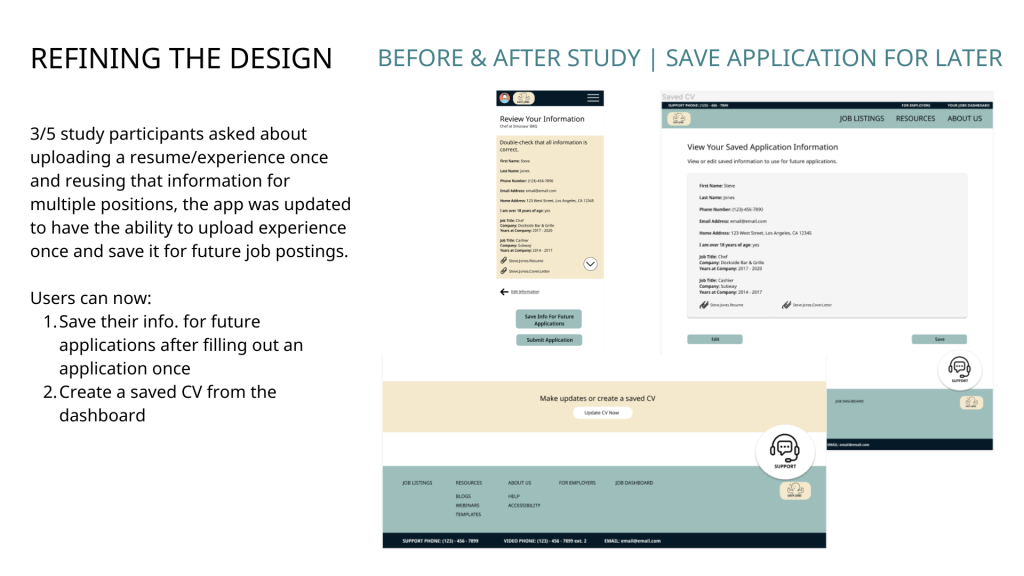
- 3/5 study participants asked about uploading a resume/experience once and reusing that information for multiple positions, the app was updated to have the ability to upload experience once and save it for future job postings.
- 1/5 study participants noticed the job listing didn’t provide pay information, so salary information/pay rates were included on all job listings.
REFINING THE DESIGN
- MOCKUPS
- HIGH-FIDELITY PROTOTYPES
- ACCESSIBILITY
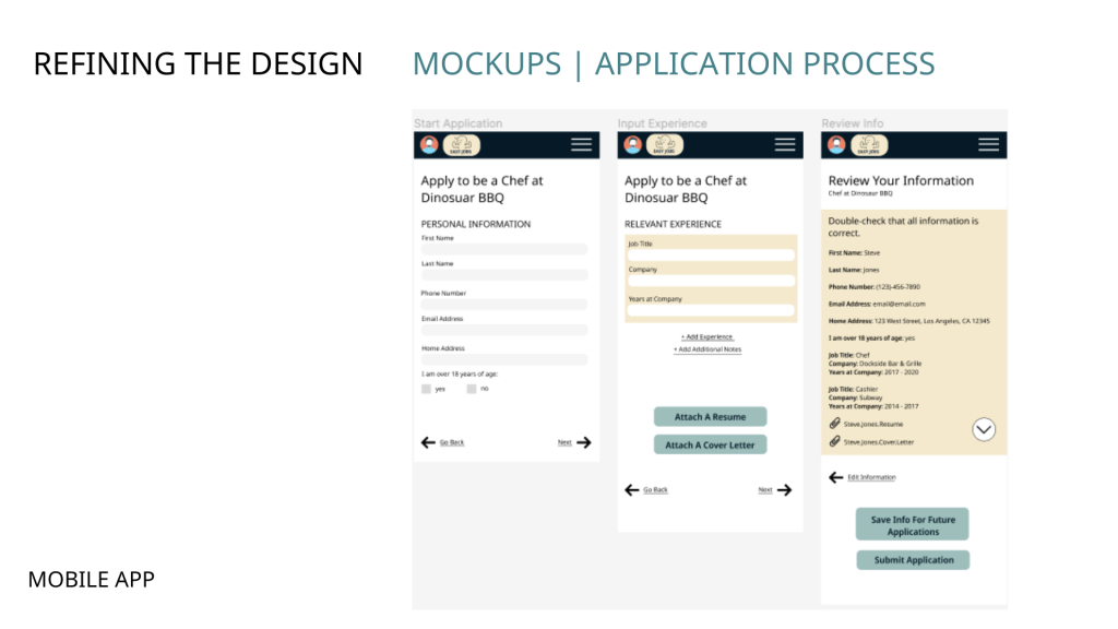
MOCKUPS


HIGH-FIDELITY PROTOTYPES
Main User Flow: “Design a multi-platform job search service to help people who are formerly incarcerated”

📱 View the mobile high-fidelity prototype
💻 View the desktop/tablet high-fidelity prototype
ACCESSIBILITY CONSIDERATIONS
- Video Phone link in the footer of the responsive website makes it easy for Deaf/Hard-of-Hearing individuals to call and get support.
- Accessibility settings on both the mobile app and website so the user can customize the platform to fit their needs.
- Extensive support options available on the website so users can chat, call, or email with an Easy Jobs employee for help with resume writing, applications, and more. Support resources are also available.
GOING FORWARD
- TAKEAWAYS
- NEXT STEPS
TAKEAWAYS
Designing for social good was a fun challenge, I enjoyed this process and look forward to serving more individuals in the future with my UX designs. My usability study participants also had positive things to say about the platform, including:
“This is how I like websites, simple and easy to follow” – Participant A
WHAT I LEARNED
Designing wireframes/mockups for a mobile app and responsive website is very time consuming, and it’s important to double-check that all elements/colors/fonts are consistent. It’s also difficult to create the best version of a product without authentic feedback, I do not know any formerly incarcerated individuals so I could not ask them to be a part of the research process. If I were to build this app in the real world, I would definitely use more diverse usability study participants that include formerly incarcerated individuals.
NEXT STEPS
- Building out the employer portal – I developed the flow from a job seeker perspective, but not from an employer open to hiring formerly incarcerated individuals. The process and user research would be completely different from their perspective.
- Doing a follow-up usability study to determine how easy or difficult the responsive website high-fidelity prototype is to use, and continuing to iterate on my designs based on feedback.
- Creating mockups to simulate the experience of a user switching to a language other than English to use the app or responsive website.
- Developing this website and app in the real world! This was a student project, so neither of these designs will be put into production.
If you liked this case study, get in touch with me! Or, view the rest of my portfolio.
Thanks for viewing!
🥩 🥑 You might enjoy this related case study: NUTRA-CALC: Creating a Nutrition Facts Calculator For an Australian Steakhouse
